Visualising the Berlin Train Network
A few years ago I came across this very concise but intriguing post on Antonio Sánchez Chinchón’s blog which features a beautiful matrix visualisation technique (as well as a Calle 13 quote).
Ever since then I had it on my to-do list to build a similar visualisation but could never quite decide on which matrix I wanted to visualise. A few days ago I thought that Berlin’s U- and S-Bahn network would be a nice candidate for such a visualisation.
Graphs and Adjacency Matrices
So how do we turn the Berlin train network into a matrix? For this, let’s take a look at the classic route map of the Berlin train network:
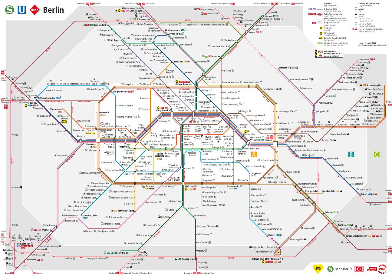
In mathematical terms we can interpret the train network as a graph structure. Simply put, a graph is a collection of points (the nodes) and connections between those points (the edges of the graph). In our case the nodes are the train stations and the edges are the direct connections between those stations (direct meaning reachable in just one stop).
Now graphs can be described using a so-called adjacency matrix which indicates which nodes of the graph are connected. For a network of \(n\) nodes the matrix would consist of \(n\) rows and \(n\) columns (so a total of \(n \times n\) entries). The entry in the \(i\)-th row and the \(j\)-th column would indicate whether or not there is a connection between the \(i\)-th node and the \(j\)-th node in the graph. If there is a connection this value will be \(1\) and \(0\) otherwise.
So for example, a matrix that describes the connection between the four Berlin train stations Hauptbahnhof, Friedrichstraße, Hackescher Markt, and Unter den Linden would look as follows:
\[ \left(\begin{array}{cc} 0 & 1 & 0 & 0\\ 1 & 0 & 1 & 1\\ 0 & 1 & 0 & 0\\ 0 & 1 & 0 & 0\\ \end{array}\right) \] The four stations are ordered along the rows/columns in the same way as we listed them above. Therefore we can find out which stations are connected to Hauptbahnhof by simply going through the entries in the first row. We can see that Hauptbahnhof is only connected to Friedrichstraße (the second entry is a one, the remaining ones are zero). We can also see that Friedrichstraße is connected to all other stations in this network (all entries are one except for the second which corresponds to the station itself) and Hackescher Markt and Unter den Linden are only connected to Friedrichstraße (only second entry is a one in rows three and four).
For our visualisation we do not care about the direction of the train lines but only if there is a connection between two respective stations. Therefore our adjacency matrix will always be symmetric (i.e. you can flip it on the diagonal and retain the same matrix).
In the Berlin traffic network there can be more than one line connecting certain stations and for our visualisation we will want to draw multiple lines in this case. In terms of the adjacency matrix that means that instead of values of one we will put a value equal to the number of direct connections between those two stations.
For example, there are four lines between Hauptbahnhof and Friedrichstraße. Therefore we would put a \(4\) in the second column of the first row and the first column of the second row.
Visualising the Adjacency Matrix or the Graph?
So now we have learned that there is a direct connection between the adjacency matrix and its corresponding graph structure and this connection also applies to how we can visualise them.
If we take another look at the visualisation of the 20x20 matrix from Antonio’s blog post we can now interpret it as the visualisation of a graph with 20 nodes in which each node is linked to every other node (and since the diagonal elements are one every node is connected to itself as well).
One key component of his visualisation is the arrangement of the nodes of the graph in a circle which we will also use for our visualisation of the Berlin train network.
Since the visualisation of the adjacency matrix is equivalent to the visualisation of a graph we won’t have to bother with creating a matrix but can rely on tools that work directly with graph structures. Luckily in R such tools exist in the form of the great tidygraph and ggraph packages written by Thomas Lin Pedersen.
A reproduction of the 20x20 matrix visualisation using these tools would look as follows:
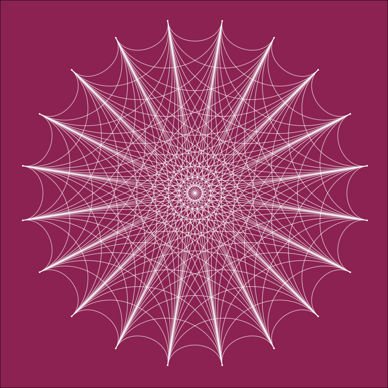
The main difference between this representation and the Chord diagram used in
Antonio’s blogpost is that in the ggraph version each node in the graph is
represented by a point on the circle whereas in the Chord diagram a segment of
the circle is used. This makes for the more pointy look in our version
Our visualisation of the Berlin traffic network will probably look much less symmetric and regular since not all stops are connected with each other. We can also expect the points on the circle to be much more condensed as there are way more than twenty train stations in Berlin (in fact there are 316 U- and S-Bahn stations).
Getting the GTFS Data
To build our visualisation we will need some data to build our graph with. Luckily this data is available through the Berlin Open Data project in the General Transit Feed Specification format.
This dataset consists of multiple CSV files that each describe certain aspects of the Berlin traffic network (e.g. stations, routes, stops, time tables etc.). The data requires quite a lot of transformations before we can use it to build our graph. For example, there are multiple stations that refer to the Alexanderplatz station but in our graph we would like to have only one, so we will need to map them first. If you are interested in the transformation steps you can check out the code here.
Arranging the Nodes Along the Circle
One thing that we still need to decide on is the order with which the nodes (stations) will be arranged on the circle.
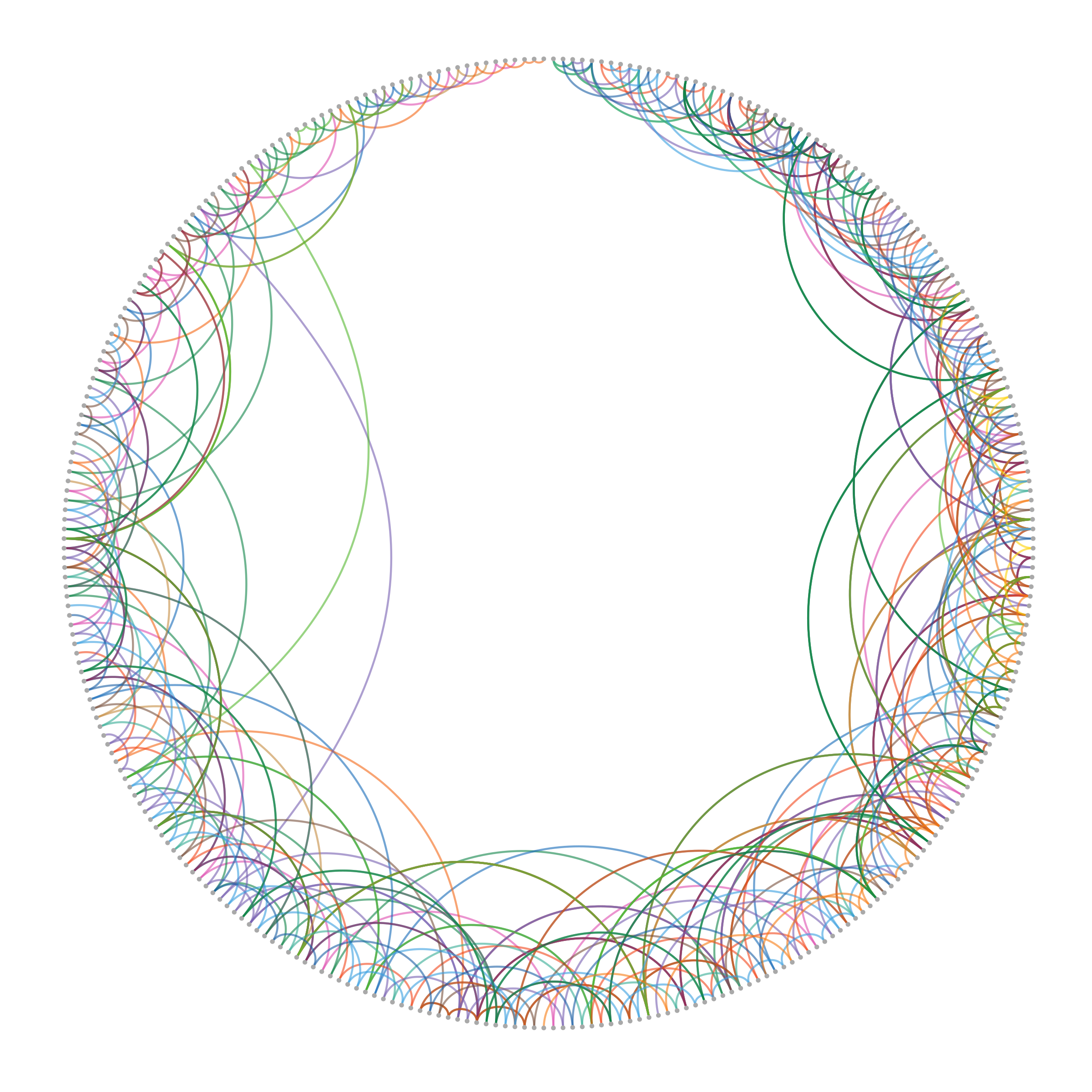
This choice which will heavily influence the look of our final visualisation but it is also highly subjective as there is no “canonical” way of mapping the stations to positions on the circle. One of the simplest choices which might be a logical starting point would be to order the stations alphabetically. With this choice our visualisation would look as follows:
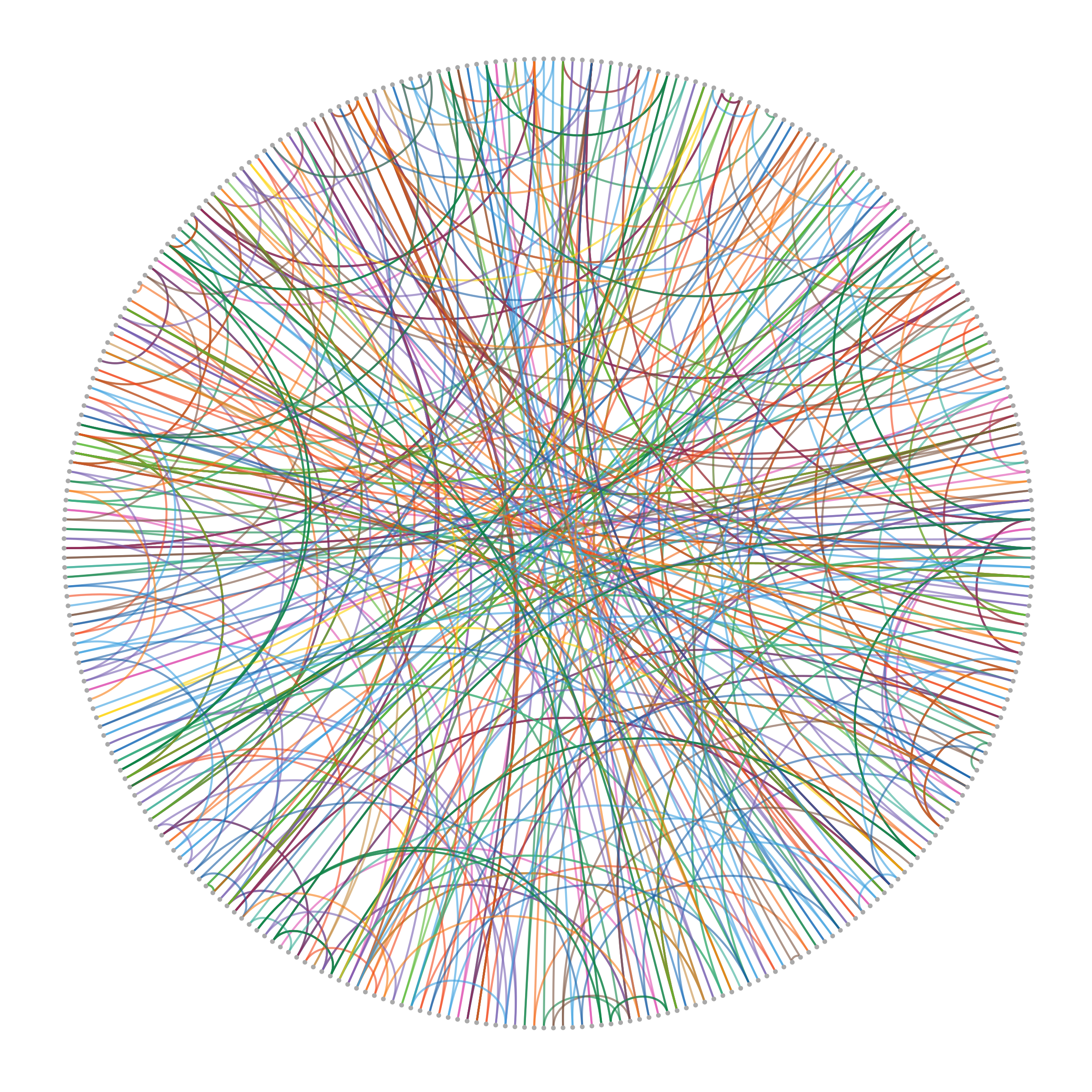
In this graph the point in the top center of the circle corresponds to the station Adenauerplatz and from that point on the stations are ordered alphabetically in clockwise order up until the point left of the top center which corresponds to Zwickauer Damm. The colors for the edges correspond to the official colors of the train lines.
This ordering is probably quite close to a random node order as generally there will be very little relationship between the station names and how they are connected to each other (with some few exceptions such as the stations Strausberg Bhf, Strausberg Nord, and Straubserg Stadt).
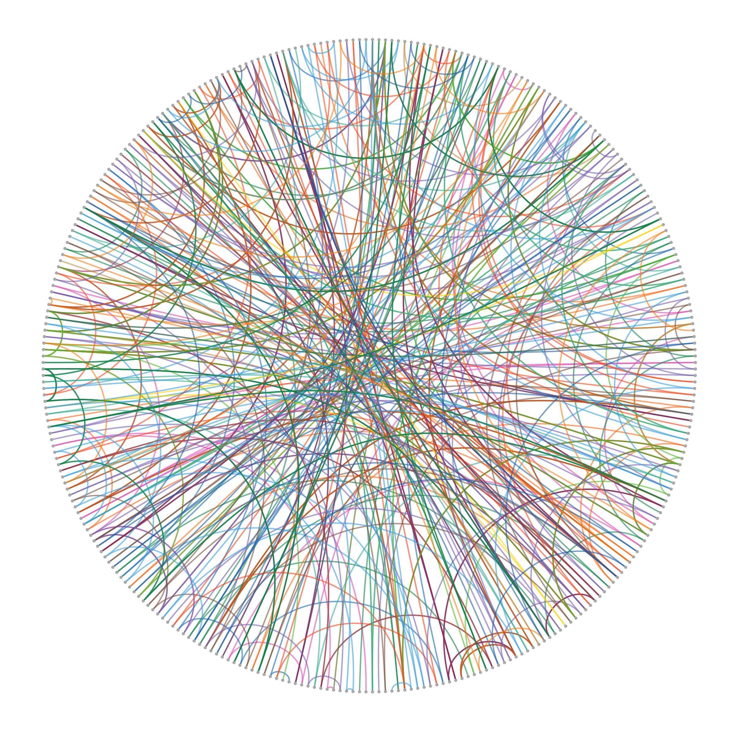
In fact the results we get from a random node ordering does not differ so much visually from the alphabetical one:
We could also think about ways to incorporate some geographical information about the stations into the mapping. While it is not possible to retain all information when mapping the two-dimensional coordinates onto the one-dimensional circle we can at least incorporate some of it by ordering the stations according to their distance from the geographical center of Berlin.
This means that points that are close to each other on the circle (except for the last and first one) lie on circles around the city center whose radii are close to each other. Of course this could still mean that nodes that are next to each other could represent stations that lie far away from each other geographically (e.g. stations that lie on the opposite side of a circle with the same radius). However, we should definitely see a pattern where very few to none nodes from the upper right side of the circle will be connected to the upper left side of the circle as this would correspond to very long distances between train stations.
Indeed we can see that this geographical ordering results in a very different pattern than what we have seen before with almost no lines going through the center of the circle. We can also see that some of the furthest connections are made by S-Bahn lines (e.g the purple S7 or green S8) which makes sense as their route takes them further outside the city where the distance between stops tends to be longer.
A More Beautiful Plot
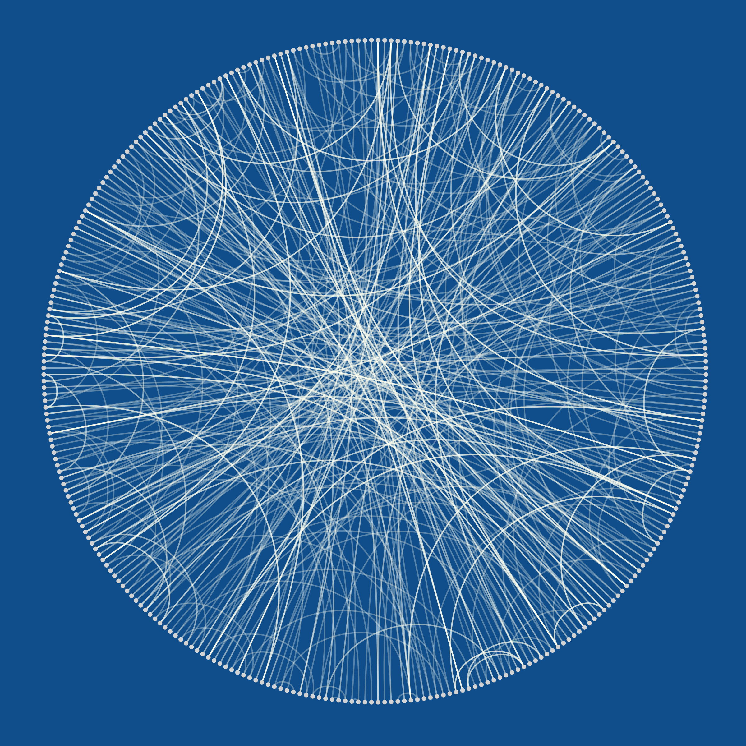
In the end, the choice of node ordering is really a subjective one. For the final visualisation I decided to go with a random ordering as I personally found it visually the most appealing and the idea of this visualisation was to create something nice to look at and not necessarily something that is effective at communicating information (I don’t think anyone would use this kind of graph to navigate the city).
To give the visualisation some of the same hypnotic and mesmerizing quality as the visualisation from Antonio’s blog post I decided to choose a similar look. Replacing the different edge colors with white and plotting everything on a blue background results in a much less busy but high contrast visual:
An Animated Version
One final thing we can do is build an animated version of the graph using the
gganimate package which seamlessly
integrates with ggraph.
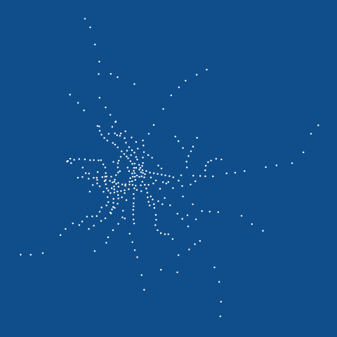
The following animation starts out with the nodes in the position corresponding to their geographical location on the map, will move them to their (random) position on the circle and then have the connections between the nodes appear:
Much more can be done with this data visualisation, especially with the animated version. For example, I would have liked to keep the edges between the nodes intact while moving the nodes from the circle back to their geographical positions but was not quite able to get this working.
If you are interested in the how the visualisations in this post were created or would like to build your own ones from the data you can check out the code here.